.
The Symbol Library
Presentation
The Symbol Library is the place where users can create generic symbols to be used in several QGIS projects. It allows users to export and import symbols, groups symbols and add, edit and remove symbols. You can open it with the Settings ‣ Style Library or from the Style tab in the vector layer’s Properties.
Share and import symbols
Users can export and import symbols in two main formats: qml (QGIS format) and SLD (OGC standard). Note that SLD format is not fully supported by QGIS.
 share item displays a drop down list to let the user import or
export symbols.
share item displays a drop down list to let the user import or
export symbols.
Groups and smart groups
Groups are categories of Symbols and smart groups are dynamic groups.
To create a group, right-click on an existing group or on the main Groups
directory in the left of the library. You can also select a group and click
on the  add item button.
To add a symbol into a group, you can either right click on a symbol then choose
Apply group and then the group name added before. There is a second
way to add several symbols into group: just select a group and click
 and choose Group Symbols. All symbols display a checkbox
that allow you to add the symbol into the selected groups. When finished, you can
click on the same button, and choose Finish Grouping.
and choose Group Symbols. All symbols display a checkbox
that allow you to add the symbol into the selected groups. When finished, you can
click on the same button, and choose Finish Grouping.
Create Smart Symbols is similar to creating group, but instead select Smart Groups. The dialog box allow user to choose the expression to select symbols in order to appear in the smart group (contains some tags, member of a group, have a string in its name, etc.)
Add, edit, remove symbol
With the Style manager from the [Symbol]  menu you
can manage your symbols. You can add item,
menu you
can manage your symbols. You can add item,
 edit item,
  remove item and
share item. ‘Marker’ symbols, ‘Line’ symbols, ‘Fill’ patterns and
‘colour ramps’ can be used to create the symbols.
The symbols are then assigned to ‘All Symbols’, ‘Groups’ or ‘Smart groups’.
remove item and
share item. ‘Marker’ symbols, ‘Line’ symbols, ‘Fill’ patterns and
‘colour ramps’ can be used to create the symbols.
The symbols are then assigned to ‘All Symbols’, ‘Groups’ or ‘Smart groups’.
For each kind of symbols, you will find always the same dialog structure:
- at the top left side a symbol representation
- under the symbol representation the symbol tree show the symbol layers
- at the right you can setup some parameter (unit,transparency, color, size and rotation)
- under these parameters you find some symbol from the symbols library
The symbol tree allow adding, removing or protect new simple symbol. You can move up or down the symbol layer.
More detailed settings can be made when clicking on the second level in the Symbol layers dialog. You can define Symbol layers that are combined afterwards. A symbol can consist of several Symbol layers. Settings will be shown later in this chapter.
Tip
Note that once you have set the size in the lower levels of the Symbol layers dialog, the size of the whole symbol can be changed with the Size menu in the first level again. The size of the lower levels changes accordingly, while the size ratio is maintained.
Marker Symbols
Marker symbols have several symbol layer types:
- Ellipse marker
- Font marker
- Simple marker (default)
- SVG marker
- Vector Field marker
The following settings are possible:
- Symbol layer type: You have the option to use Ellipse markers, Font markers, Simple markers, SVG markers and Vector Field markers.
- colors
- Size
- Outline style
- Outline width
- Angle
- Offset X,Y: You can shift the symbol in the x- or y-direction.
- Anchor point
- Data defined properties ...
Line Symbols
Line marker symbols have only two symbol layer types:
- Marker line
- Simple line (default)
The default symbol layer type draws a simple line whereas the other display a marker point regularly on the line. You can choose different location vertex, interval or central point. Marker line can have offset along the line or offset line. Finally, rotation allows you to change the orientation of the symbol.
The following settings are possible:
- colour
- Pen width
- Offset
- Pen style
- Join style
- Cap style
Use custom dash pattern
- Dash pattern unit
- Data defined properties ...
Polygon Symbols
Polygon marker symbols have also several symbol layer types:
- Centroid fill
- Gradient fill
- Line pattern fill
- Point pattern fill
- Raster image fill
- SVG fill
- Shapeburst fill
- Simple fill (default)
- Outline: Marker line (same as line marker)
- Outline: simple line (same as line marker)
The following settings are possible:
- Colors for the border and the fill.
- Fill style
- Border style
- Border width
- Offset X,Y
- Data defined properties ...
Using the color combo box, you can drag and drop color for one color button to another button, copy-paste color, pick color from somewhere, choose a color from the palette or from recent or standard color. The combo box allow you to fill in the feature with transparency. You can also just click on the button to open the palettte dialog. Note that you can import color from some external software like GIMP.
With the ‘Raster image fill’ you can fill polygons with a tiled raster image. Options include (data defined) file name, opacity, image size (in pixels, mm or map units), coordinate mode (feature or view) and rotation.
‘Gradient Fill’ Symbol layer type allows you to select
between a  Two color
and
Two color
and  Color ramp setting. You can use the
Feature centroid as Referencepoint.
All fills ‘Gradient Fill` Symbol layer type is also
available through the Symbol menu of the Categorized and
Graduated Renderer and through the Rule properties menu of
the Rule-based renderer. Other possibility is to choose a ‘shapeburst
fill’ which is a buffered gradient fill, where a gradient is drawn from
the boundary of a polygon towards the polygon’s centre. Configurable
parameters include distance from the boundary to shade, use of color ramps or
simple two color gradients, optional blurring of the fill and offsets.
Color ramp setting. You can use the
Feature centroid as Referencepoint.
All fills ‘Gradient Fill` Symbol layer type is also
available through the Symbol menu of the Categorized and
Graduated Renderer and through the Rule properties menu of
the Rule-based renderer. Other possibility is to choose a ‘shapeburst
fill’ which is a buffered gradient fill, where a gradient is drawn from
the boundary of a polygon towards the polygon’s centre. Configurable
parameters include distance from the boundary to shade, use of color ramps or
simple two color gradients, optional blurring of the fill and offsets.
It is possible to only draw polygon borders inside the polygon. Using
‘Outline: Simple line’ select Draw line
only inside polygon.
Color ramp
You can create a custom color ramp choosing New color ramp...
from the color ramp drop-down menu. A dialog will prompt for the ramp type:
Gradient, Random, colorBrewer, or cpt-city. The first three have options for number of steps
and/or multiple stops in the color ramp. You can use the Invert option while classifying
the data with a color ramp. See figure_symbology_3 for an
example of custom color ramp and figure_symbology_3a for the cpt-city dialog.
Figure Symbology 3:
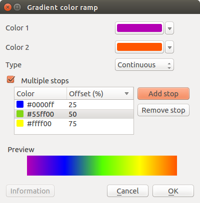
Example of custom gradient color ramp with multiple stops 
The cpt-city option opens a new dialog with hundreds of themes included ‘out of the box’.
Figure Symbology 3a:
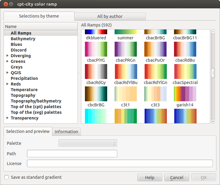
cpt-city dialog with hundreds of color ramps