.
プリントコンポーザ
プリントコンポーザはレイアウトと印刷機能をどんどん発展させて提供しています.これによって QGIS マップキャンバス,テキストラベル,イメージ,凡例,スケールバー,基本図形,矢印,属性テーブルとHTMLフレームのようなエレメントを追加することができます. ここではそれぞれのエレメントのサイズ,グループ,配置と位置をプロパティで調整してレイアウトを行います. レイアウトは印刷またはイメージ形式,PostScript,PDFまたはSVGで出力できます (最近の いくつかのQt4 バージョンではSVGへの出力は適切に動作しません; これを動かす場合はあなたのシステムで個別にチェックして下さい). あなたはレイアウトをテンプレートとして保存して別のセッションでロードして使うことができます. 最後に多くの地図をテンプレートにもとづいて作成する作業が地図帳作成機能で行えます. table_composer_1 にあるツールの一覧を参照して下さい:
アイコン
|
目的
|
アイコン
|
目的
|
|---|
| |
|
|
|
 |
プロジェクトの保存
|
 |
新コンポーザ
|
 |
コンポーザの複製
|
 |
コンポーザマネージャ
|
 |
テンプレートからロードする
|
 |
テンプレートとして保存する
|
 |
印刷または Postscriptとして出力する
|
 |
イメージ画像として出力する
|
 |
SVGとして出力する
|
 |
PDF型式で出力する
|
 |
アンドゥ
|
 |
最後の変更を元に戻す
|
 |
全域表示
|
 |
100%にズームする
|
 |
拡大
|
|
縮小
|
 |
ビューの更新
|
|
|
 |
パン
|
 |
指定領域にズームする
|
 |
印刷構成でアイテムを選択/移動する
|
 |
アイテム内のコンテンツを移動する
|
 |
QGIS マップキャンバスから新規地図を追加する
|
 |
印刷構成にイメージ画像を追加
|
 |
印刷構成にラベルを追加
|
 |
印刷構成に新規凡例を追加
|
 |
印刷構成にスケールバー追加
|
 |
印刷構成に基本図形を追加
|
 |
印刷構成に矢印を追加
|
 |
印刷構成に属性テーブルを追加
|
 |
HTMLフレームの追加
|
|
|
 |
印刷構成内のアイテムをグループ化する
|
 |
印刷構成内のアイテムグループを解除する
|
| |
選択アイテムをロックする
|
|
すべてのアイテムをアンロックする
|
 |
アイテムを前面に移動
|
 |
選択アイテムを背面に移動
|
 |
選択アイテムを最前面に移動
|
 |
選択アイテムを最背面に移動
|
 |
選択アイテムを左側で整列
|
 |
選択アイテムを右側で整列
|
 |
選択アイテムを中央合わせで整列
|
 |
選択アイテムを水平方向の中央で整列
|
 |
選択アイテムを上側線で整列
|
 |
選択アイテムを下側線で整列
|
 |
地図帳のプレビュー
|
 |
最初のフィーチャ
|
 |
前のフィーチャ
|
 |
次のフィーチャ
|
 |
最後のフィーチャ
|
|
地図帳の印刷
|
|
地図帳をイメージとして出力する
|
 |
地図帳の設定
|
Table Composer 1: プリントコンポーザツール
すべてのプリントコンポーザツールはメニューとツールバーアイコンから利用できます.ツールバーはマウスをツールバーの上に置いた状態で右ボタンで表示、非表示を切り替えることができます.
最初のステップ
新しいプリントコンポーザテンプレートを開く
プリントコンポーザで作業を始める前にいくつかのラスタやベクタレイヤを QGIS マップキャンバスにロードしてそれらのプロパティを必要に応じて調整してください.あなたの好みの地図が描画されたらツールバーの New Print Composer アイコンをクリックするか を選択して下さい. 新しいコンポーザのタイトル入力プロンプトが表示されます.
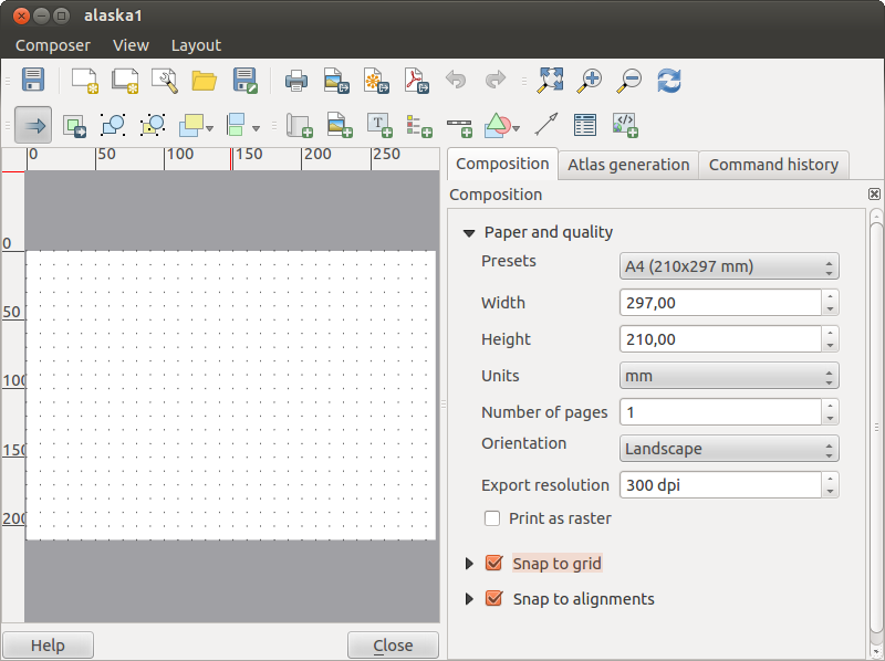
Using Print Composer
Opening the Print Composer provides you with a blank canvas to which you can add
the current QGIS map canvas, text labels, images, legends, scale bars, basic
shapes, arrows, attribute tables and HTML frames. Figure_composer_1 shows the
initial view of the Print Composer before any elements are added.
Figure Composer 1:
The Print Composer provides four tabs:
プリントコンポーザウィンドウの一番下にはステータスバーがあります,そこにはマウスの位置,カレントページ番号とズームレベルを指定できるコンボボックスがあります.
コンポーザーには複数のエレメントを追加できます. 複数の地図や凡例やスケールバーをプリントコンポーザキャンバスに配置したり,単一か複数のページを構成することもできます. それぞれのエレメントは独自のプロパティを持ち,地図の場合は独自の領域をもてます. 任意のエレメントをコンポーザキャンバスから削除したい場合 Delete または Backspace キーで可能です.
プリントコンポーザオプション
From you can set some options that will be
used as default during your work.
コンポジションデフォルト デフォルトで利用するフォントを指定できます.
With グリッドの外見, グリッドのスタイルを色を指定できます.
Grid defaults ではグリッドの間隔,オフセット,許容値を指定できます. grid: Dots, Solid ラインと Crosses の3タイプのグリッドがあります.
ガイドデフォルト ではガイドの許容値を指定できます.
コンポジションタブ — 一般的なコンポジションのセットアップ
コンポジション タブで、コンポジションの全体的な設定を定義できます。
- You can choose one of the Presets for your paper sheet, or enter your custom width and height.
コンポジションは現在多くのページに分割可能になりました. たとえば最初のページに地図キャンバスを表示して2番目のページにレイヤの属性テーブルを表示して3番目のページにあなたの組織のウェッブサイトにリンクするHTMLフレームを表示することが可能です. Number of pages にお望みの値を指定して下さい. あとページの 向き と 出力解像度 を指定できます.  print as raster がチェックされていると印刷の前に全てのエレメントがラスタ化されるか PostScriptかPDFで保存されます.
グリッド では グリッド幅, グリッドオフセット と 許容値 を必要に応じて設定できます.
- In Snap to alignments, you can change the Tolerance, which is the maximum distance below which an item is snapped to smart guides.
グリッドとスマートガイドへのスナップは メニューで有効にできます. このメニューではグリッドとスマートガイドを非表示にすることもできます.
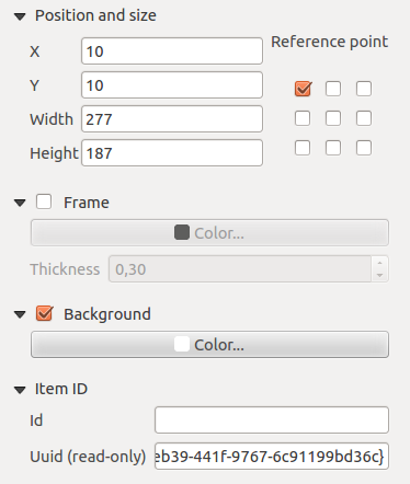
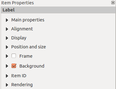
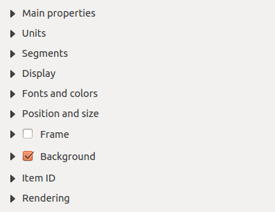
Composer items general options
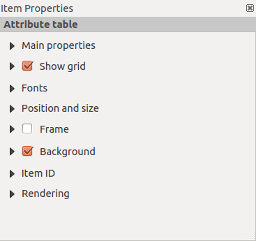
Composer items have a set of common properties you will find on the bottom of the Item Properties tab: Position and size, Frame,
Background, Item ID and Rendering (See figure_composer_2).
Figure Composer 2:
レンダリングモード
QGIS ベクタやラスタレイヤと同じように先進的なレンダリングがコンポーザーアイテムでも行えるようになりました.
Figure Composer 3:
Layer transparency  : このツールによって地図キャンパスにおけるレイヤの可視性を設定できます. このスライダでベクタレイヤの可視性を調整できます. メニューの横にあるスライダを使ってレイヤの表示比率を定義することができます.
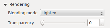
レイヤ混合モード: を使うと今までグラフィックプログラムでしか利用できなかったようなすばらしい描画エフェクトを利用することができます.上書きされるレイヤと下に描画されるレイヤのピクセルを下記のような方法で混ぜることができます.
通常: これは標準的な混合モードでトップピクセルのアルファチャンネルを使い下のピクセルと混合します; 色は混合されません
Lighten: この場合フォアグランドとバックグラウンドのピクセルからそれぞれのコンポーネントの最大値を選択します. この結果はギザギザや極端な場合があることに注意して下さい.
Screen: ソースのライトピクセルが書き込み先の上に書き込まれます, 一方ダークピクセルは書き込まれません. このモードはあるレイヤの模様を他のレイヤに混ぜたい場合便利です. (たとえば標高陰影を他のレイヤに重ねる場合利用できます).
覆い焼き: 覆い焼きはトップレベルピクセルの明るさのレベルを基にして下のピクセルの明度をあげ彩度をあげます.ですからトップピクセルが明るくなると下のピクセルの彩度と明度があがります. トップピクセルがそんなに明るくない場合エフェクトは強くかかりうまく動作します.
加算: この混合モードはあるレイヤのピクセル値を単純に他のレイヤに加算します. 値が1以上の場合 (RGBの場合), 白が表示されます. このモードは地物をハイライトさせたい場合に適しています.
暗く:前景色と背景のピクセルの最小の構成要素を保持して生じたピクセルを作成します。明るくのような、結果がギザギザと厳しくなりがちです。
乗算:これは、最下レイヤに対応するピクセルと最上レイヤの各ピクセルの数値を乗算します。結果は暗いピクチャです。
焼き込み:最上レイヤにある暗い色は、下のレイヤが暗くなります。下にあるレイヤを微調整し、色の強調に使用することができます。
オーバーレイ:乗算と網掛けモードを組み合わせたものです。ピクチャのライトパーツの軽量化の結果、明るい部分はより明るくなり、暗い部分がより暗くなります。
ソフトライト:オーバーレイに非常に似ていますが、乗算/覆い焼きの代わりに、色の焼き込み/ダッジを使用しています。この1つは画像の上に柔らかな光が輝いてエミュレートすることになっています。
- Hard light: Hard light is very similar to the overlay mode. It’s supposed to emulate projecting a very intense light onto an image.
差分:差分は、下のピクセルまたは周囲の別のものから上のピクセルを減算し、正の値を取得します。すべてのカラーが0であるため、黒とプレンドしても何も変化しません。
減算: このブレンドモードでは単純にあるレイヤのピクセル値から他のレイヤのピクセル値を引きます. 負の値の数が与えられると黒が表示されます.
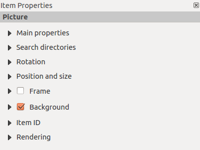
コンポーザアイテム
Adding a current QGIS map canvas to the Print Composer
Click on the Add new map toolbar button in the Print
Composer toolbar to add the QGIS map canvas. Now, drag a rectangle onto the Composer
canvas with the left mouse button to add the map. To display the current map, you
can choose between three different modes in the map Item Properties
tab:
四角形 はデフォルトの設定です. これは ‘Map will be printed here’ のメッセージを表示した中身の無いボックスを表示します.
キャッシュ は現在のスクリーンの解像度で地図を描画します. 拡大したり表示がコンポーザウィンドウからはずれた場合地図は再描画されませんがイメージのスケールは行われます.
レンダー の場合ズームインやコンポーザウィンドウから領域が移動した場合地図が再描画されます,しかしスペースの問題で最大解像度までで限定されます.
キャッシュ が新規にプリントコンポーザに地図が追加された時のデフォルトプレビューモードです。
You can resize the map element by clicking on the
Select/Move item button, selecting the element, and dragging one of the
blue handles in the corner of the map. With the map selected, you can now adapt
more properties in the map Item Properties tab.
To move layers within the map element, select the map element, click the
Move item content icon and move the layers within
the map element frame with the left mouse button. After you have found the right place
for an element, you can lock the element position within the Print Composer
canvas. Select the map element and click on the right mouse button to  Lock the element position and again to unlock the element. You can also lock
the map element by activating the Lock layers for map
item checkbox in the Map dialog of the Item Properties
tab.
Lock the element position and again to unlock the element. You can also lock
the map element by activating the Lock layers for map
item checkbox in the Map dialog of the Item Properties
tab.
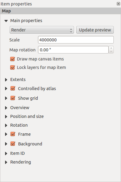
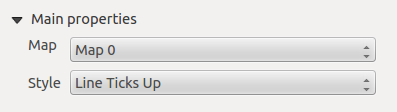
メインプロパティ
The Main properties dialog of the map Item Properies tab provides the
following functionalities (see figure_composer_4):
Figure Composer 4:
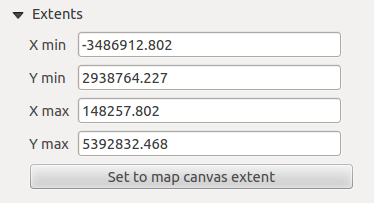
領域
The Extents dialog of the map item tab provides the following
functionalities (see figure_composer_5):
Figure Composer 5:
- The Map extent area allows you to specify the map extent using Y and X min/max
values or by clicking the [Set to map canvas extent] button.
If you change the view on the QGIS map canvas by changing
vector or raster properties, you can update the Print Composer view by selecting
the map element in the Print Composer and clicking the [Update preview] button
in the map Item Properties tab (see figure_composer_2).
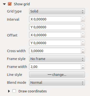
グリッド
The Grid dialog of the map Item Properties tab provides the
following functionalities (see Figure_composer_6):
Figure Composer 6:
- The Show grid checkbox allows you to overlay a grid onto the
map element. As grid type, you can specify to use a solid line or cross. Symbology of
the grid can be chosen. See section Rendering_Mode.
Furthermore, you can define an interval in the X and Y directions, an X and Y offset,
and the width used for the cross or line grid type.
- You can choose to paint the frame with a zebra style. If not selected, the general frame option is used (see section Frame_dialog).
Advanced rendering mode is also available for grids (see section Rendering_mode).
- The Draw coordinates checkbox allows you to add coordinates
to the map frame. The annotation can be drawn inside or outside the map frame.
The annotation direction can be defined as horizontal, vertical, horizontal and
vertical, or boundary direction, for each border individually. Units can be in meters or in degrees. Finally, you can define the grid
color, the annotation font, the annotation distance from the map frame and the precision of the drawn coordinates.
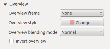
Overview
The Overview dialog of the map Item Properties tab provides the
following functionalities (see Figure_composer_7):
Figure Composer 7:
If the Composer has more than one map, you can choose to use a first map to show the extents of a second map.
The Overview dialog of the map Item Properties tab allows you to customize the appearance of that feature.
- The Overview frame combo list references the map item whose extents will be drawn on the present map item.
- The Overview Style allows you to change the frame color. See section vector_style_manager .
- The Overview Blend mode allows you to set different transparency blend modes, to enhance visibility of the frame. See Rendering_Mode.
- If checked, Invert overview creates a mask around the extents: the referenced map extents are shown clearly,
whereas everything else is blended with the frame color.
Adding a Label item to the Print Composer
To add a label, click the Add label icon, place the element
with the left mouse button on the Print Composer canvas and position and customize
its appearance in the label Item Properties tab.
The Item Properties tab of a label item provides the following functionalities:
Figure Composer 8:
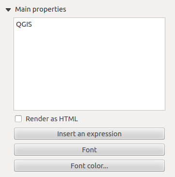
メインプロパティ
The Main properties dialog of the label Item Properties tab provides the
following functionalities (see Figure_composer_9):
Figure Composer 9:
- The main properties dialog is where the text (HTML or not) or the expression needed to fill the label is added to the Composer
canvas.
- Labels can be interpreted as HTML code: check Render as HTML. You can now insert a URL, a clickable
image that links to a web page or something more complex.
- You can also insert an expression. Click on [Insert an expression] to open a new dialog. Build an expression by clicking the
functions available in the left side of the panel. On the right side of the Insert an expression dialog, the help file
associated with the function selected is displayed. Two special categories can be useful, particularly associated with the atlas functionality:
geometry functions and records functions. At the bottom, a preview of the expression is shown.
- Define font and font color by clicking on the [Font] and [Font color...] buttons.
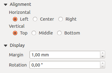
アライメントと表示
The Alignment and Display dialogs of the label Item Properties tab provide the
following functionalities (see Figure_composer_10):
Figure Composer 10:
- You can define the horizontal and vertical alignment in the Alignment zone.
- In the Display tag, you can define a margin in mm and/or a rotation angle in degrees for the text.
Adding an Image item to the Print Composer
To add an image, click the Add image icon, place the element
with the left mouse button on the Print Composer canvas and position and customize
its appearance in the image Item Properties tab.
The image Item Properties tab provides the following functionalities (see figure_composer_11):
Figure Composer 11:
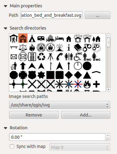
Main properties, Search directories and Rotation
The Main properties and Search directories dialogs of the image Item Properties tab provide the
following functionalities (see Figure_composer_12):
Figure Composer 12:
- The Main properties dialog shows the current image that is displayed in the image item.
Click on the [...] button to select a file on your computer.
- This dialog shows all pictures stored in the selected directories.
- The Search directories area allows you to add and remove directories with
images in SVG format to the picture database.
- Images can be rotated with the Rotation
 field.
- Activating the Sync with
map checkbox synchronizes the rotation of a picture in the QGIS map canvas
(i.e., a rotated north arrow) with the appropriate Print Composer image.
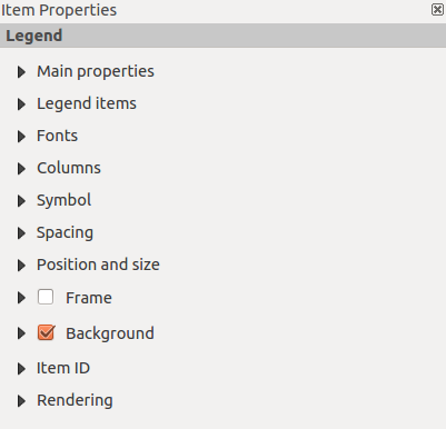
Adding a Legend item to the Print Composer
To add a map legend, click the Add new legend icon,
place the element with the left mouse button on the Print Composer canvas and
position and customize the appearance in the legend Item Properties
tab.
The Item properties of a legend item tab provides the following
functionalities (see figure_composer_14):
Figure Composer 13:
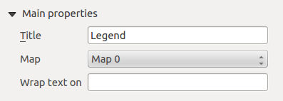
メインプロパティ
The Main properties dialog of the legend Item Properties tab
provides the following functionalities (see figure_composer_14):
Figure Composer 14:
- Here, you can adapt the legend title.
- You can also choose which Map item the current legend will refer to in the select list.
- Since QGIS 1.8, you can wrap the text of the legend title on a given character.
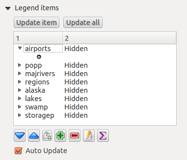
凡例アイテム
The Legend items dialog of the legend Item Properties tab
provides the following functionalities (see figure_composer_15):
Figure Composer 15:
- The legend items window lists all legend items and allows you to change item order,
group layers, remove and restore items in the list, and edit layer names. After changing the
symbology in the QGIS main window, you can click on [Update] to adapt the
changes in the legend element of the Print Composer. The item order can be
changed using the [Up] and [Down] buttons or with ‘drag-and-drop’
functionality.
- The feature count for each vector layer can be shown by enabling the [Sigma] button.
- The legend will be updated automatically if Auto-update is checked.
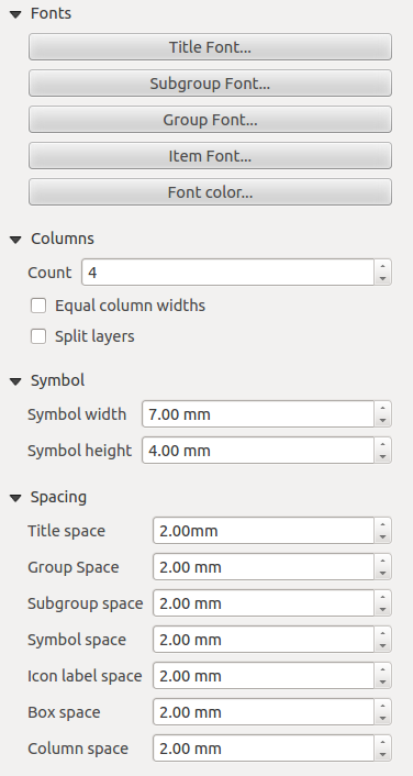
Fonts, Columns, Symbol and Spacing
The Fonts, Columns, Symbol and Spacing dialogs of the legend Item Properties tab
provide the following functionalities (see figure_composer_16):
Figure Composer 16:
Adding a Scale Bar item to the Print Composer
To add a scale bar, click the Add new scalebar icon, place
the element with the left mouse button on the Print Composer canvas and position
and customize the appearance in the scale bar Item Properties tab.
The Item properties of a scale bar item tab provides the following
functionalities (see figure_composer_17):
Figure Composer 17:
メインプロパティ
The Main properties dialog of the scale bar Item Properties tab
provides the following functionalities (see figure_composer_18):
Figure Composer 18:
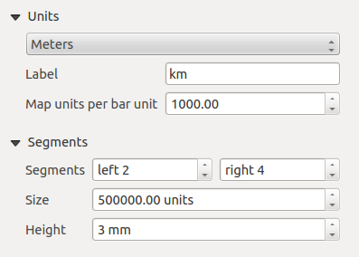
単位とセグメント
The Units and Segments dialogs of the scale bar Item Properties tab
provide the following functionalities (see figure_composer_19):
Figure Composer 19:
In these two dialogs, you can set how the scale bar will be represented.
- Select the map units used. There are three possible choices: Map Units is the automated unit
selection; Meters or Feet force unit conversions.
- The Label field defines the text used to describe the units of the scale bar.
- The Map units per bar unit allows you to fix the ratio between a map unit and its representation in the scale bar.
- You can define how many Segments will be drawn on the left and on the right side of the scale bar,
and how long each segment will be (Size field). Height can also be defined.
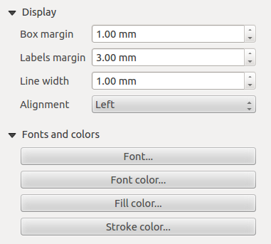
Display, Fonts and colors
The Display and Fonts and colors dialogs of the scale bar Item Properties tab provide the following functionalities (see figure_composer_20):
Figure Composer 20:
- You can define how the scale bar will be displayed in its frame. Adjust the Box margin between text and frame borders,
Labels margin between text and scale bar drawing and the Line width of the scale bar drawing.
- The Alignment in the Display dialog only applies to Numeric styled scale bars and puts text on the
left, middle or right side of the frame.
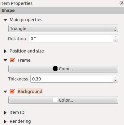
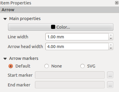
Adding a Basic shape or Arrow item to the Print Composer
It is possible to add basic shapes (ellipse, rectangle, triangle) and arrows
to the Print Composer canvas: Click the Add basic shape icon or the
Add Arrow icon, place the element with the left mouse button on the Print Composer canvas and position
and customize the appearance in the Item Properties tab.
The Shape item properties tab allows you to draw an ellipse, rectangle, or triangle
in the Print Composer canvas. You can define its outline and fill color, the
outline width and a clockwise rotation. For the rectangle shape, you can change the value
of the corner radius.
Figure Composer 21:
The Arrow item properties tab allows you to draw an arrow in the Print Composer canvas.
You can define color, outline and arrow width, and it is possible to use a default
marker, no marker, or an SVG marker. For the SVG marker, you can additionally
add an SVG start and end marker from a directory on your computer.
Figure Composer 22:
メインプロパティ
- For basic shapes, this dialog allows you to choose an Ellipse, Rectangle or Triangle shape and its rotation.
- Unlike the other items, line style, line color and background color of a basic shape are adjusted with the Frame and Background dialog.
No frame is drawn.
- For arrows, you can define here the line style: Color, Line width and Arrow head width.
- Arrows markers can be adjusted. If you want to set an SVG Start marker and/or End marker, browse to
your SVG file by clicking on the [...] button after selecting the SVG radio button.
ノート
Unlike other items, the background color for a basic shape is the shape background and not the frame background.
Add attribute table values to the Print Composer
It is possible to add parts of a vector attribute table to the Print Composer
canvas: Click the Add attribute table icon, place the element with the left mouse button on the Print Composer
canvas, and position and customize the appearance in the Item Properties tab.
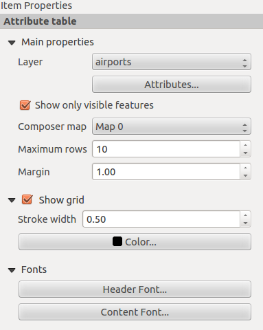
The Item properties of an attribute table item tab provides the following
functionalities (see figure_composer_23):
Figure Composer 23:
Main properties, Show grid and Fonts
The Main properties, Show grid and Fonts dialogs of the attribute table Item Properties tab
provide the following functionalities (see figure_composer_24):
Figure Composer 24:
Figure Composer 25:
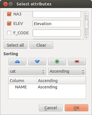
- The Table dialog allows you to select the vector layer and columns of the attribute table. Attribute columns can be sorted, and you
can specify whether to show values in ascending or descending order (see figure_composer_25).
- You can choose to display the attributes of only features visible on a map. Check Show only visible features and
select the corresponding Composer map to filter.
- You can define the Maximum number of rows to be displayed and the margin around text.
- Additionally, you can define the grid characteristics of the table (Stroke width and Color of the grid) and the
header and content font.
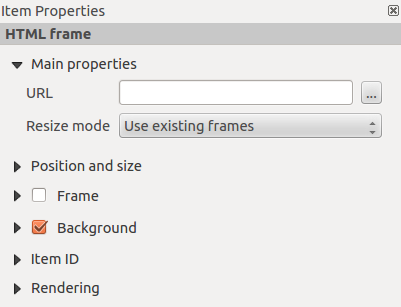
Add an HTML frame to the Print Composer
It is possible to add a clickable frame linked to a URL: Click the Add HTML frame icon, place the element with
the left mouse button on the Print Composer canvas and position and customize the appearance in the Item Properties tab.
メインプロパティ
The Main properties dialog of the HTML frame Item Properties tab
provides the following functionalities (see figure_composer_26):
Figure Composer 26:
- Point the URL field to the URL or the HTML file you want to insert in the Composer.
- You can adjust the rendering of the page with the Resize mode.
- Use existing frames constrains the page inside its first frame or in the frame created with the next settings.
- Extent to next page will create as many frames (and corresponding pages) as necessary to render the height of the web page. Each frame can be
moved around on the layout. If you resize a frame, the webpage will be divided up between the other frames. The last frame will be trimmed to
fit the web page.
- Repeat on every page will repeat the upper left of the web page on every page in frames of the same size.
- Repeat until finished will also create as many frames as the Extend to next page option, except all frames will have the same
size.
アイテムの管理
サイズと位置
Each item inside the Composer can be moved/resized to create a perfect layout.
For both operations the first step is to activate the Select/Move item
tool and to click on the item; you can then move it using the mouse while holding the left button.
If you need to constrain the movements to the horizontal or the vertical axis, just hold
the Shift while moving the mouse.
If you need a better precision, you can move a selected item using the Arrow keys on the keyboard;
if the movement is too slow, you can speed up it by holding Shift.
A selected item will show squares on its boundaries; moving one of them with the mouse, will resize the item
in the corresponding direction.
While resizing, holding Shift will maintain the aspect ratio. Holding Ctrl will resize from
the item center.
The correct position for an item can be obtained using snapping to grid or smart guides. If you need to
disable the snap on the fly just hold Ctrl while moving the mouse.
You can choose multiple items with the Select/Move item button.
Just hold the Shift button and click on all the items you need. You can then resize/move
this group just like a single item.
Once you have found the correct position for an item, you can lock it by clicking with the
right mouse button. Press the same button another time to unlock it. You can also lock/unlock
items using the icons on the toolbar.
To unselect an item, just click on it holding the Shift button.
Inside the menu, you can find actions to select all the items, to clear all selections or
to invert the current selection.
配置
Raising or lowering functionalities for elements are inside the
Raise selected items pull-down menu. Choose an element on the Print Composer
canvas and select the matching functionality to raise or lower the selected
element compared to the other elements (see table_composer_1).
Figure Composer 27:
There are several alignment functionalities available within the
Align selected items pull-down menu (see table_composer_1). To use an
alignment functionality, you first select some elements and then click on the
matching alignment icon. All selected elements will then be aligned within to their common
bounding box.
When moving items on the Composer canvas, alignment helper lines appear when borders, centers or corners are aligned.
アイテムのコピー/切り取りとペースト
The print composer includes actions to use the common Copy/Cut/Paste functionality for the items
in the layout. As usual first you need to select the items using one of the options seen above;
at this point the actions can be found in the menu. When using the Paste action, the elements
will be pasted according to the current mouse position.
地図帳の生成
The Print Composer includes generation functions that allow you to create map books
in an automated way. The concept is to use a coverage layer, which contains
geometries and fields. For each geometry in the coverage layer, a new output
will be generated where the content of some canvas maps will be moved to
highlight the current geometry. Fields associated with this geometry can be used
within text labels.
Every page will be generated with each feature. To enable the generation
of an atlas and access generation parameters, refer to the Atlas generation
tab. This tab contains the following widgets (see Figure_composer_29):
Figure Composer 29:
You can use multiple map items with the atlas generation; each map will be rendered according
to the coverage features. To enable atlas generation for a specific map item, you need to check
Controlled by Atlas under the item properties of the map item. Once checked, you can set:
- An input box Margin around feature that allows you to select the amount
of space added around each geometry within the allocated map. Its value is
meaningful only when using the auto-scaling mode.
- A Fixed scale that allows you to toggle between auto-scale
and fixed-scale mode. In fixed-scale mode, the map will only be translated for
each geometry to be centered. In auto-scale mode, the map’s extents are computed
in such a way that each geometry will appear in its entirety.
ラベル
In order to adapt labels to the feature the atlas plugin iterates over, use a label with this special notation
[%expression using field_name%].
For example, for a city layer with fields CITY_NAME and ZIPCODE, you could insert this:
“[% ‘The area of ‘ || upper(CITY_NAME) || ‘,’ || ZIPCODE || ‘ is ‘ format_number($area/1000000,2) || ‘ km2’ %]“
That would result in the generated atlas as
“The area of PARIS,75001 is 1.94 km2”.
プレビュー
Once the atlas settings have been configured and map items selected, you can create a preview of all the pages by
clicking on and using the arrows, in the same menu, to navigate
through all the features.
生成
The atlas generation can be done in different ways. For example, with , you can directly print it. You can also create a PDF using : The user will be asked for a directory for saving all the generated PDF files (except if the Single file export when possible has been selected).
If you need to print just a page of the atlas, simply start the preview function, select the page you need and click on (or create a PDF).
出力の作成
Figure_composer_30 shows the Print Composer with an example print layout,
including each type of map element described in the sections above.
Figure Composer 30:
プリントコンポーザでは多彩な種類の出力形式を利用でき、それぞれの解像度(印刷品質)と紙のサイズを指定できます:
印刷 アイコンを使うと接続されたプリンタかインストールされているプリンタドライバに依存したPostScriptファイルを出力し、レイアウトを印刷することができます。
- The Export as image icon exports the Composer
canvas in several image formats, such as PNG, BPM, TIF, JPG,...
PDFとして出力 では定義されているプリントコンポーザをPDFに直接出力します。
SVGとして出力 アイコンを使うとプリントコンポーザキャンバスをSVG (Scalable Vector Graphic)として保存できます。
If you need to export your layout as a georeferenced image (i.e., to load back
inside QGIS), you need to enable this feature under the Composition tab. Check
World file on and choose the map item to use. With this option, the
‘Export as image’ action will create also a world file.
ノート
Currently, the SVG output is very basic. This is not a QGIS problem, but a
problem with the underlying Qt library. This will hopefully be sorted out in
future versions.
Exporting big rasters can sometimes fail, even if there seems to be enough memory.
This is also a problem with the underlying Qt management of rasters.
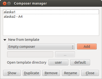
コンポーザの管理
With the Save as template and
Load from template icons, you can save the current state of a Print Composer
session as a .qpt template and load the template again in another session.
The Composer Manager button in the QGIS toolbar
and in allows you to add a new Composer
template, create a new composition based on a previously saved template or to manage
already existing templates.
Figure Composer 31:
デフォルトでコンポーザマネージャはユーザテンプレートを ~/.qgis2/composer_template で探します.
The New Composer and Duplicate Composer
buttons in the QGIS toolbar and in and
allow you to open a new Composer dialog, or to
duplicate an existing composition from a previously created one.
Finally, you can save your print composition with the Save Project button.
This is the same feature as in the QGIS main window. All changes will be saved in a QGIS project
file.

